My final project assignment for "Multi-Level Fashion Illustration" taken at SAIC in Fall 2025. This course was taught by Dijana Granov. The task was to design four tarot cards for four characters and dress them to fit the role. I chose characters from "Dr. Stone," with Suika as "The Star," Kohaku as "Strength," Xeno as "The High Priestess," and Stanley as "Judgement."
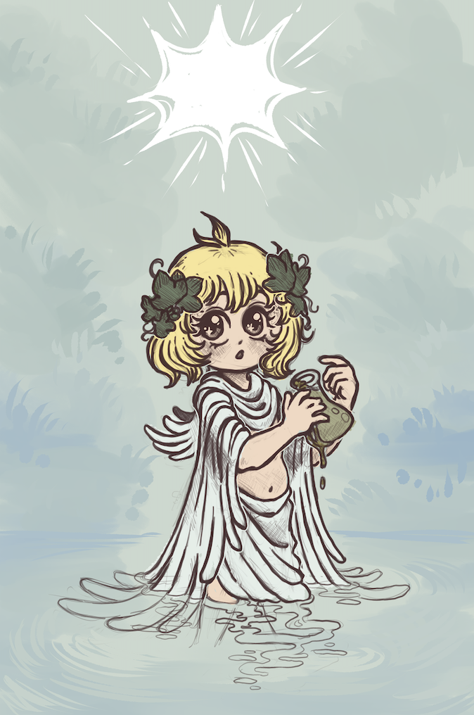
Final WIP
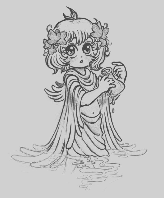
Isolated Sketch
Critique notes (Suika - The Star):
- Dijana notes:
- The Star is great as it is, just center the star
- She really enjoys the wispy background in The Star. She says I should carry this across the other pieces
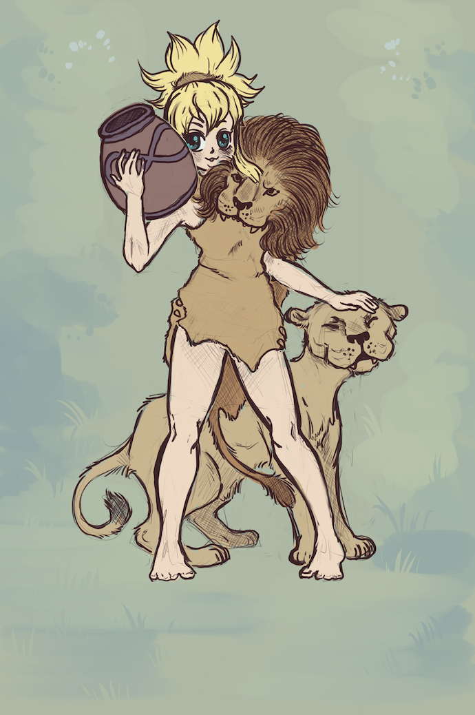
Final WIP
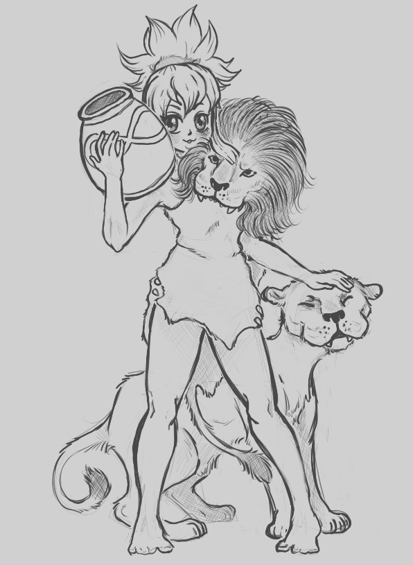
Isolated Sketch
Critique notes (Kohaku - Strength):
- Dijana notes:
- Lower Strength, she is way too high up
- Not sold on the lion in her shoulder, it looks like it’s attacking her
- The head is overkill, just keep the fur, maybe shape her hair with more of a lion’s mane shape, "I’d get rid of it"
- With the lion head there, the neck and head look wrong because it's covered up
- Anatomy wise in the legs; In the right leg, she can’t tell which way it’s twisted. I need to reshape the knee
- I do have a strange tendancy to make the forearms long, don’t I???
- ^Classmate helpfully pointed out that when you bend your arm and fold it against your body, your wrist will always be just below your shoulder, NEVER past it unless it’s in perspective, in which case there should be foreshortening and the forearm should be much thicker since its closer to us
- Dijana really loves the tail draping down behind her
- The lion head isnt necessary because the pelt is so well-drawn
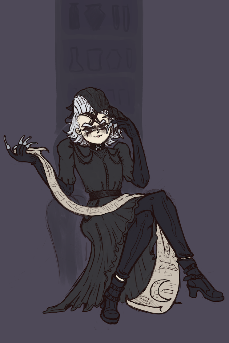
Final WIP
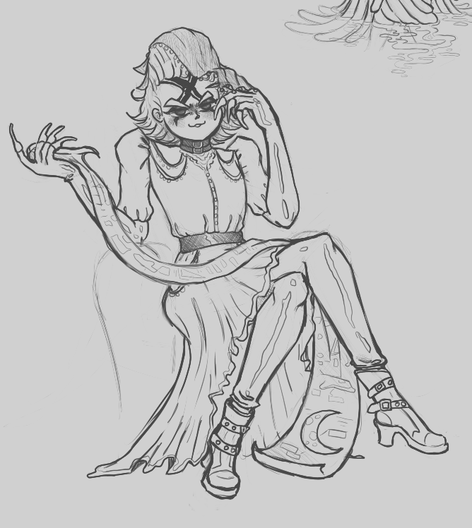
Isolated Sketch
Critique notes (Xeno - The High Priestess):
- Xeno’s arms are long
- His shoulders are close to the face
- Don't lower the shoulders, raise the head, then the neck wouldnt seem as short
- Shorten the forearms
- Lower his armpits
- I want to go in and shade darker tones with the pencil to help with shading
- ^Dijana said that would do a lot for this
- A classmate pointed out that Xeno is VERY feminine, was that on purpose?
- ^ Yes I did that on purpose since he’s already very feminine, he wears a dress in canon and the high priestess represents femininity
- Classmates said that Xeno had style and sass, like he was about to get up and walk down the runway
- “Put him in front of RuPaul” LMAO
- His dress needs to be more full and shaded
- ^I mentioned referencing the prom dress figure drawing we did in class earlier this semester
- Dijana notes:
- I mentioned I'm really not great with mechanical backrounds, so Dijana said to treat it as foliage. Have the shelf expand into the background and blur out, it doesn’t have to be super realistic glass and furniture
- I really need to vary the values in Xeno’s card. It gets so muddied together with the background, that deep purple mixes with it all
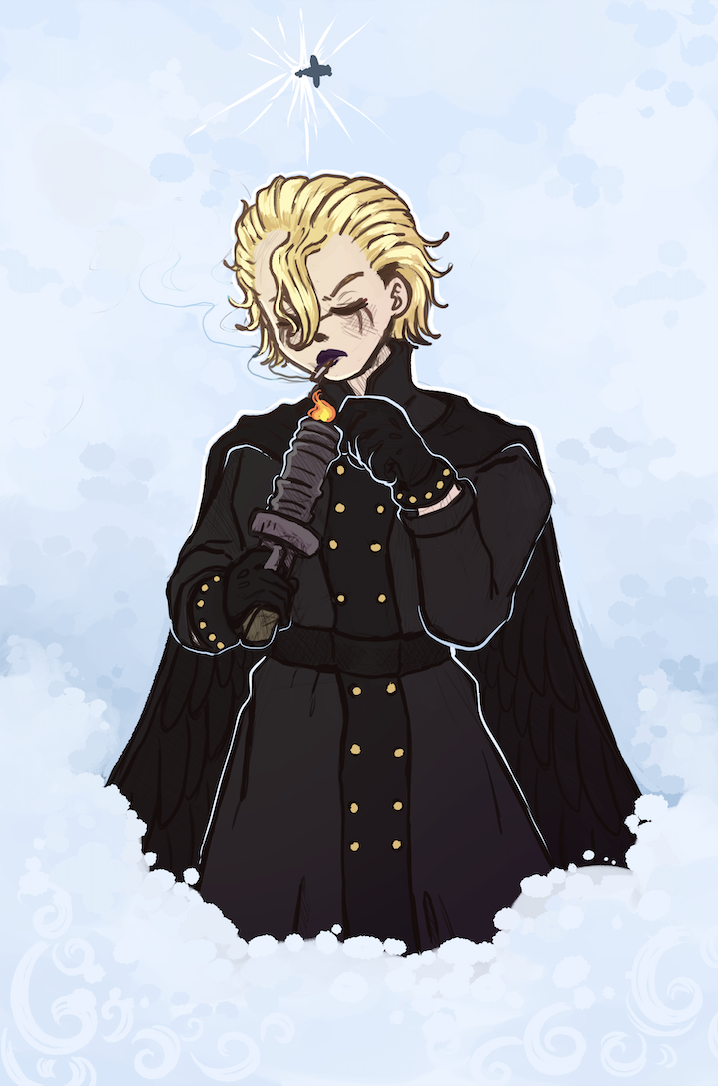
Final WIP
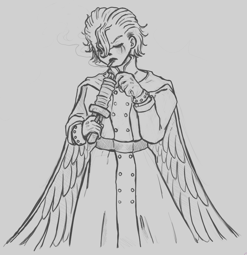
Isolated Sketch
Critique notes (Stanley - Judgement):
- Dijana notes:
- She really wants to be able to see all the detail in stanley’s wings, which got lost after the sketch
- Flip Stanley’s waist, the twist in the body doesnt make sense
- The plane in the sky needs to be bigger, right now it looks like a cross
- I don't need to show the sun/star twinkle there, get rid of that
- Make the clouds beneath Stanley more transparent like how Suika’s drapery fades into the water
Critique notes (Overall):
- I showed the sketches for Xeno and Stanley. Stanley’s wings get so lost and so does all the detail in Xeno’s outfit
- Dijana notes:
- All the content is there
- There are just a lot of formatting issues
- I asked if I should pull back on the rendering on Stanley, but Dijana said no. In fact, after I pointed it out, she said she’d like to see it (hair highlights, rimlighting, etc) in the other pieces such as The Star as well. Just don’t overdo it.